
Suncadia Experiences


THE PRODUCT
Digital Experiences Guide and Navigation Structure

DURATION
February 2025–Present
THE PROBLEM
Online guests were struggling to easily find the content they were seeking and would ultimately abandon the site.
When and if their desired content was found, there were issues with purchasing their desired product.

THE GOAL
Restructure our Experiences user flow to feature seasonal products by category based on priorities identified through user behavior. This update will create a visual hierarchy allowing guests to access desired content faster, ultimately resulting in the growth of online bookings.

MY ROLE
Product Designer

RESPONSIBILITIES
User research, prototyping, product testing and iteration, visual design updates
UNDERSTANDING THE USER: RESEARCH SUMMARY + PAIN POINTS
NAVIGATION
Our users were having trouble finding what they were looking for due to indirect navigation linking and a convoluted user journey. Our heat maps indicated that users were dropping off and not completing their purchases/sign-ups, and instead calling to book, which was tying up our reservations phone lines and causing frustration for both guests and our team. Many of the links were taking them to a landing page with information on the overall subject instead of directly to our API for booking purposes. We also realized that our navigation categories were a bit of an overload and needed to be condensed and simplified.
DIGITAL EXPERIENCES GUIDE
Previously, the Experiences guide was built out and printed quarterly allowing guests the ability to get a quick snapshot of what they could do during their specific stay. The guide was then published via a third-party software and hosted on our site for digital access. This process was clunky for guide updates and required more manual effort from our creative team, in addition to a less interactive digital experience for our guests. We stopped printing the guide and decided to go “digital-first,” creating a way for our experiences upon guest arrival to be more interactive.

Original mega nav on web

Issuu hosted Experience Guide (click to view live)
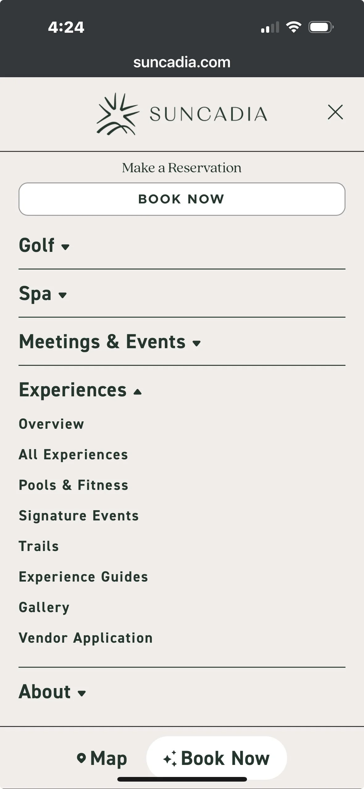
Original mega nav on mobile
WIREFRAMES, USER TESTING + FEEDBACK
I started ideating by listing all categories we needed to represent in the navigation and mocking up an idea to simplify them on paper. I then created a simple wireframe in Figma to share my idea with my team (marketing and creative). They had some great suggestions and our discussion led to defining the categories a bit more specifically. I made those updates to my wireframe.
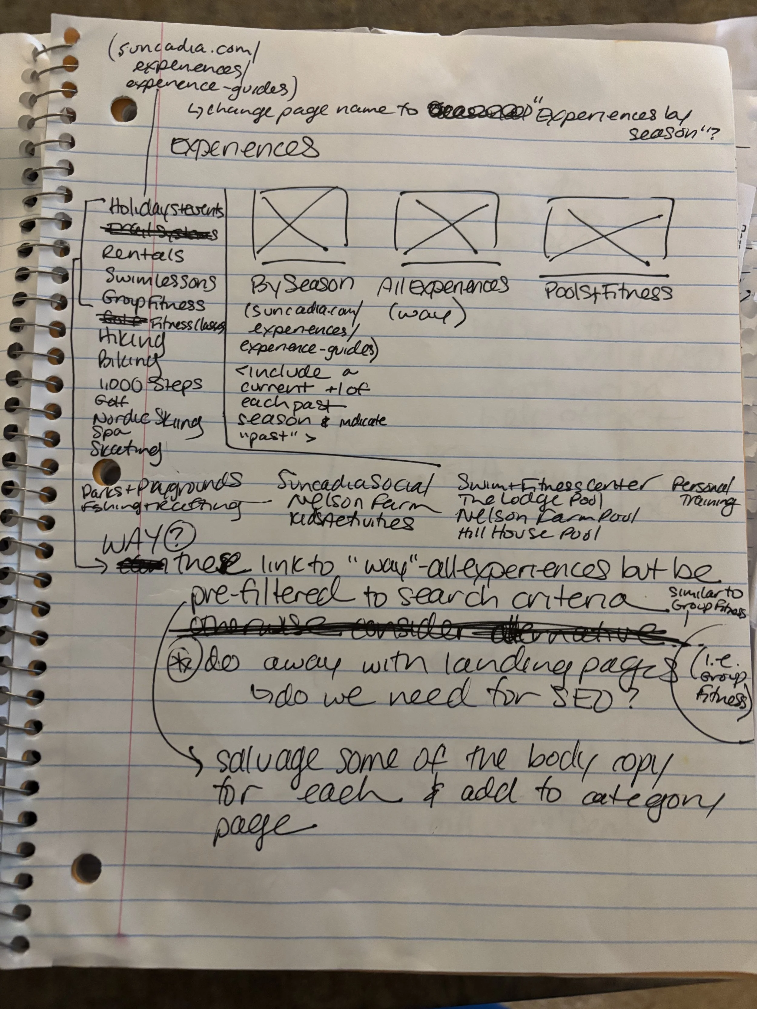
Brainstorm on how to condense the most popular categories to prioritize what the user is seeking

Initial paper wireframe sketch featuring 3 groups with a photo to highlight these in the visual hierarchy since they are what most people search for, and then a column with text links for other categories
High Fidelity Wireframe
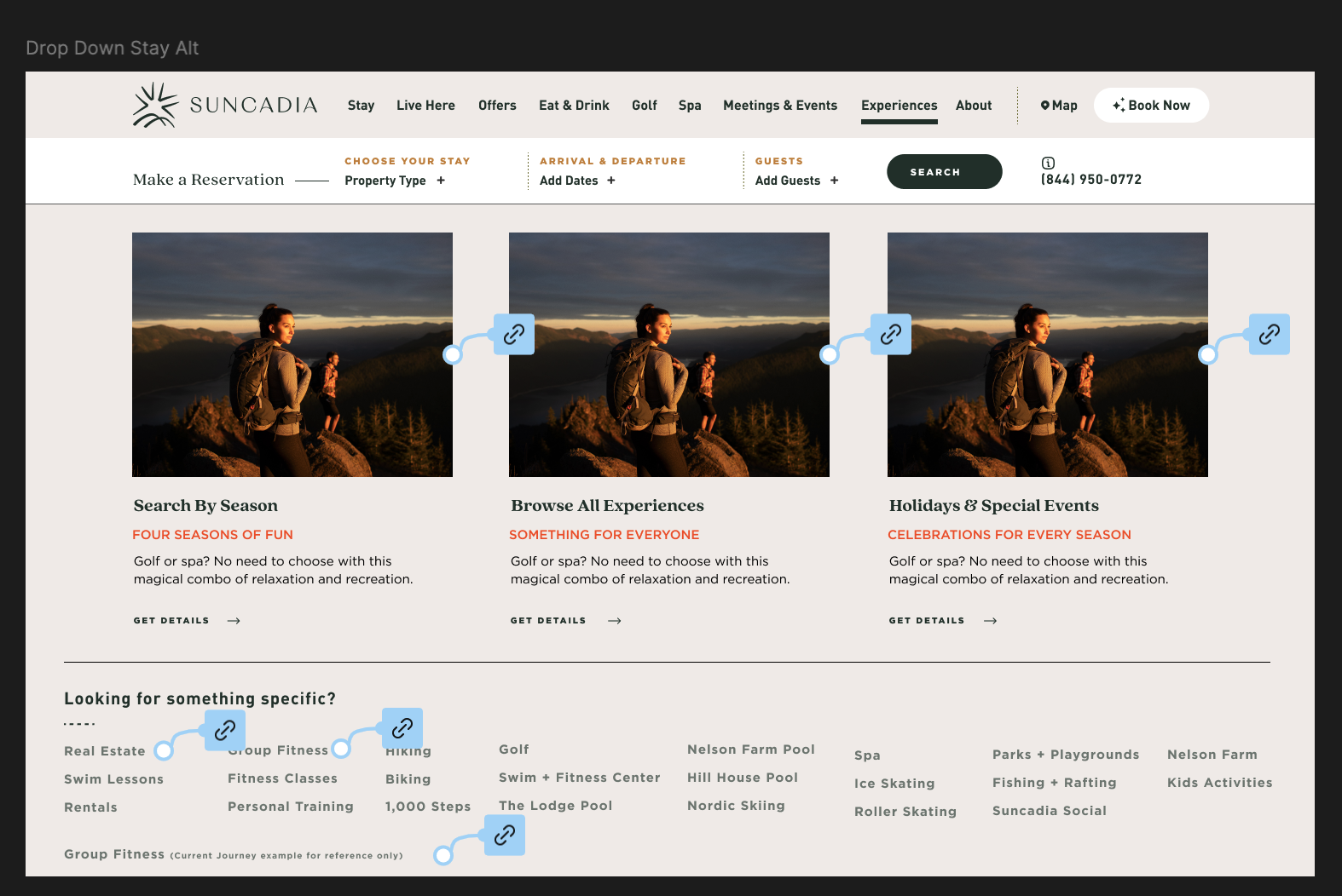
NEW EXPERIENCES NAVIGATION PROTOTYPE
Initial wireframes led to the above navigation prototype which was shared with our agency’s development team. Please click through to explore the new user journey.

Once handing the initial navigation design over to the development team, they came back with the above. We are working to highlight the three categories with images a bit more so they stand out and are larger than the list below.
FINAL NAVIGATION

NEW EXPERIENCES DIGITAL GUIDE: WIREFRAMES + PROTOTYPE
The new digital experiences guide will allow our guests to interact with the guide online and get an idea of what adventures they can go on when they are on site. The user journey will start here at ‘Search by Season’, where they will be brought to a landing page that allows them to browse each season or take a look at specific holidays and special events. Each quarterly guide will take you to that specific landing page with a quick description at the top and then an immediately visible grouping of categories that is a jump navigation, which allows you to quickly browse each category (spa, recreation, eat + drink, pools, fitness, etc.). This solution will get the user where they want to be much faster than paging through an entire guide to find what they’re looking for.

Brainstorm, categorizing which activities go under which jump navigation button on a specific seasons’ Experiences Guide page

New Experience Guides landing page paper wireframe https://suncadia.com/experiences/experience-guides/
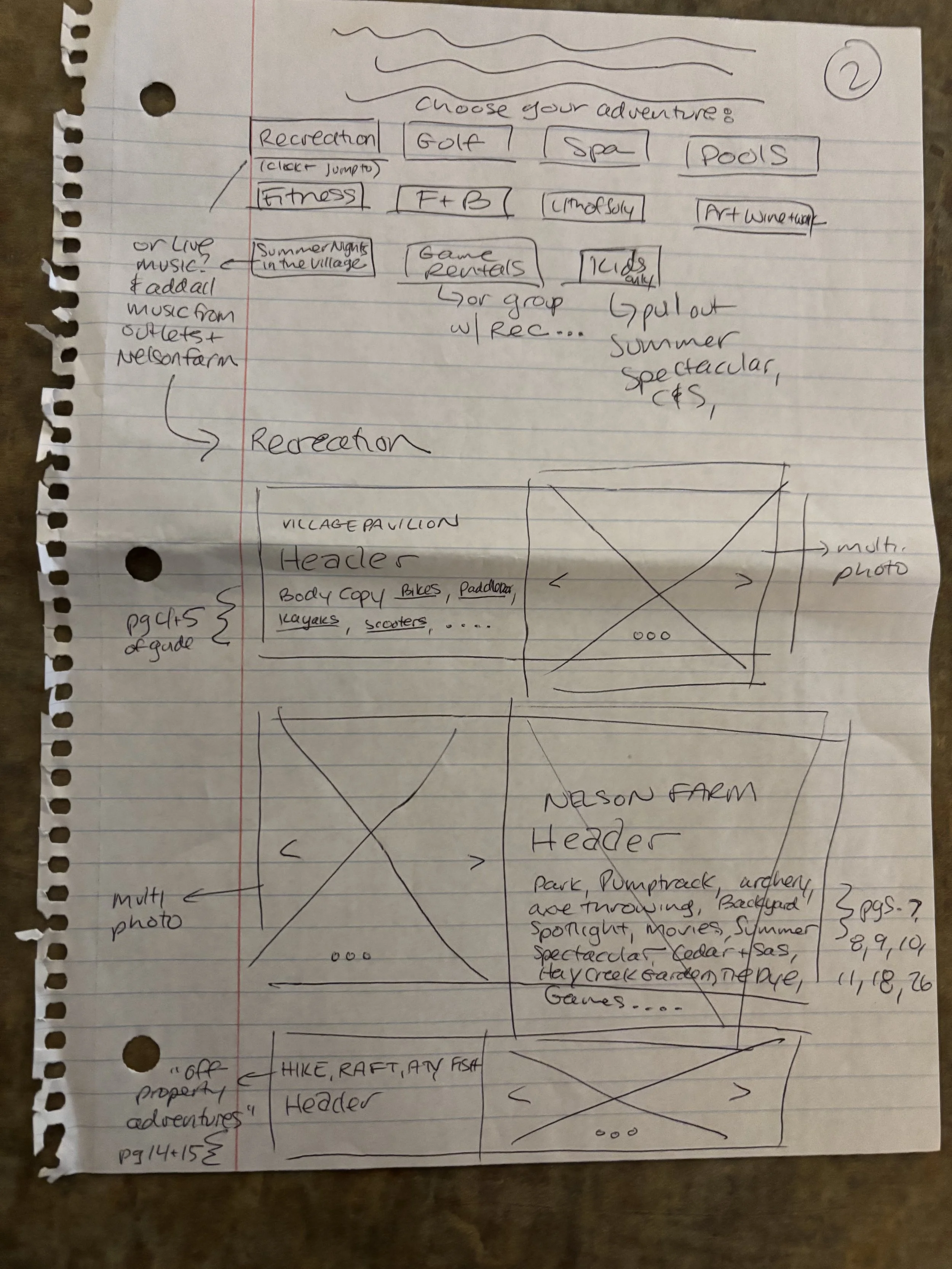
New Experiences Guides seasonal landing page paper wireframe (dev work in progress, links coming!). Each category block will then have live text outlining pertinent information. In order to make this idea come to life we had our development team code a few new custom carousel blocks that will allow us to feature photo and video and tell a more robust story of each category.
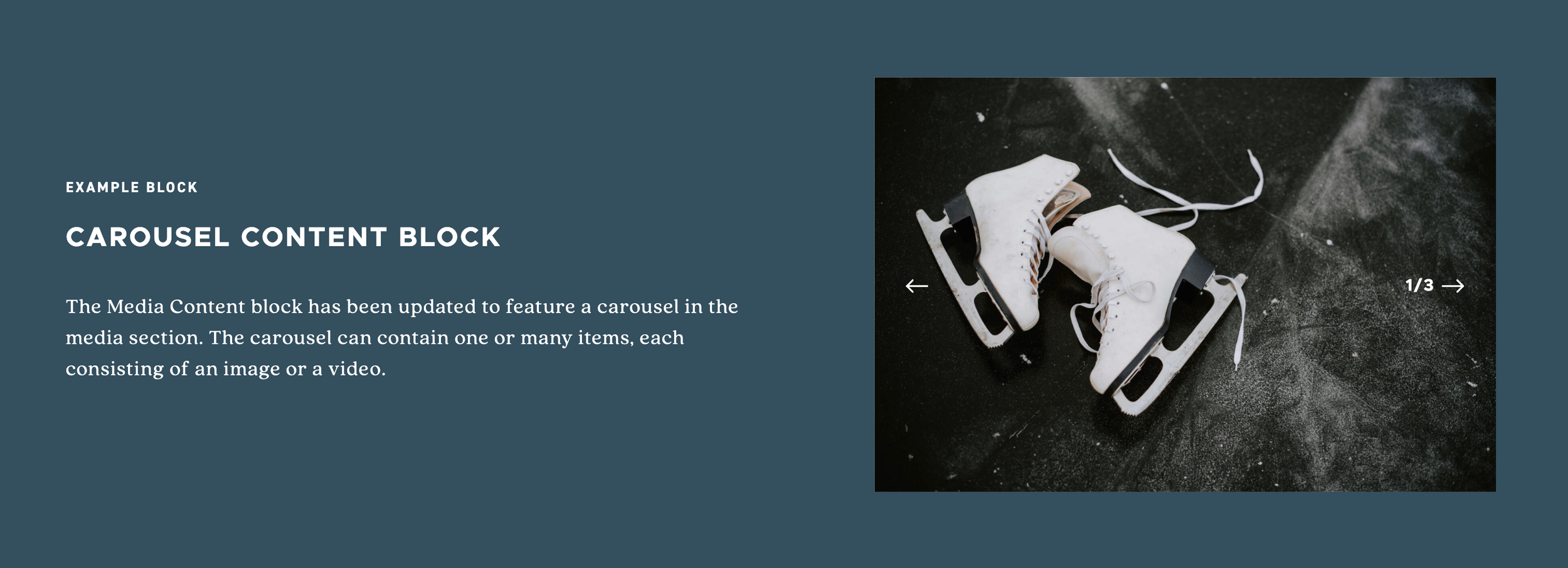
New custom content blocks (static image preview)

High Fidelity Wireframe
High Fidelity Prototype (please click through to preview the new journey)
FINAL EXPERIENCES GUIDE 2.0: Fall 2025 & WinterFest 2025
